


San Telmo
Pharmacy
Pharmacy
Briefing
Solution
The San Telmo Pharmacy is located in an emblematic area of Málaga and needed a new identity design that would mark the beginning of a new phase. Additionally, they wanted to reflect their closeness to the neighborhood and their name.
The only requirement was to maintain the traditional color of the pharmaceutical industry combined with an earthy color.
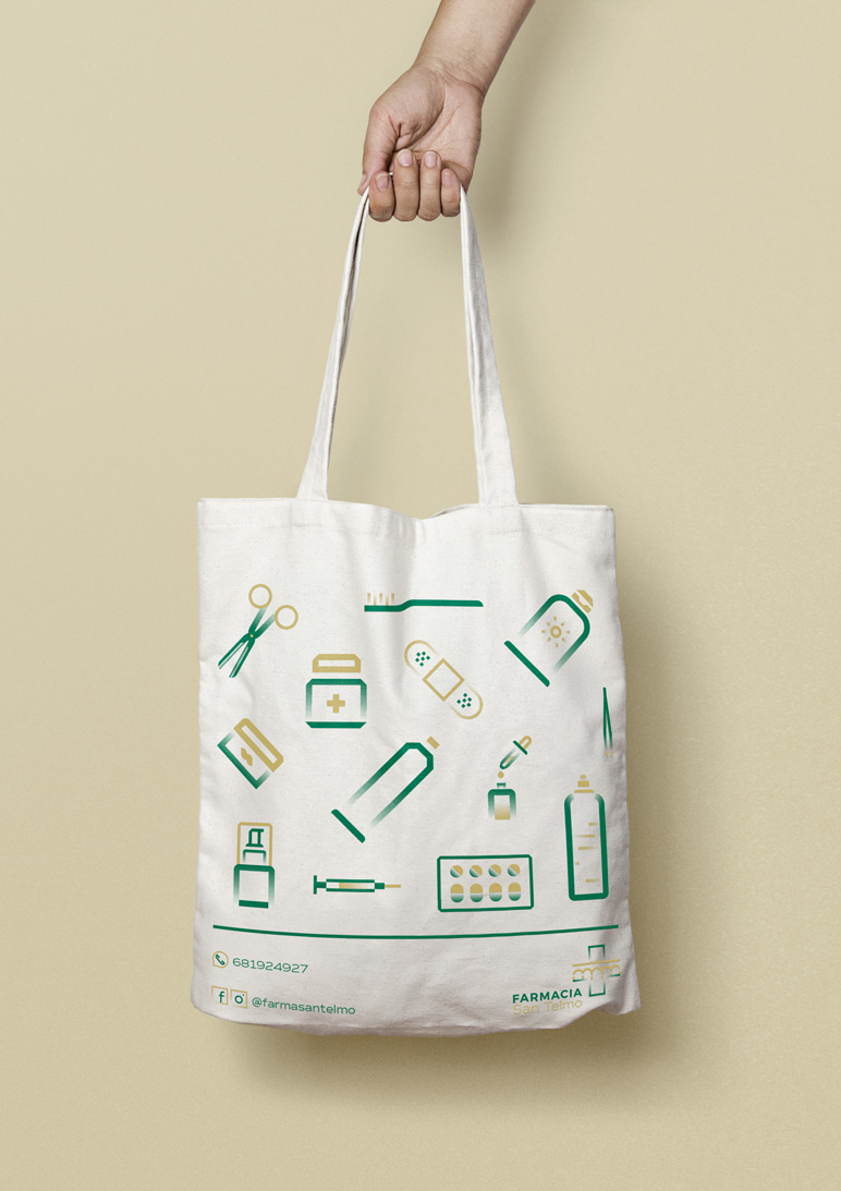
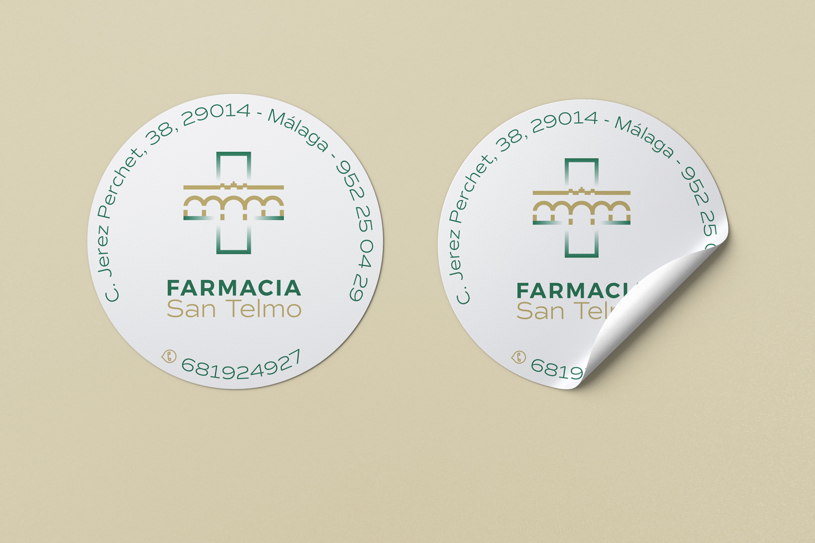
We started by designing a symbol that merged the emblem of the neighborhood (the San Telmo aqueduct) with the pharmacy cross. This way, we illustrated the connection between the pharmacy and the neighborhood.
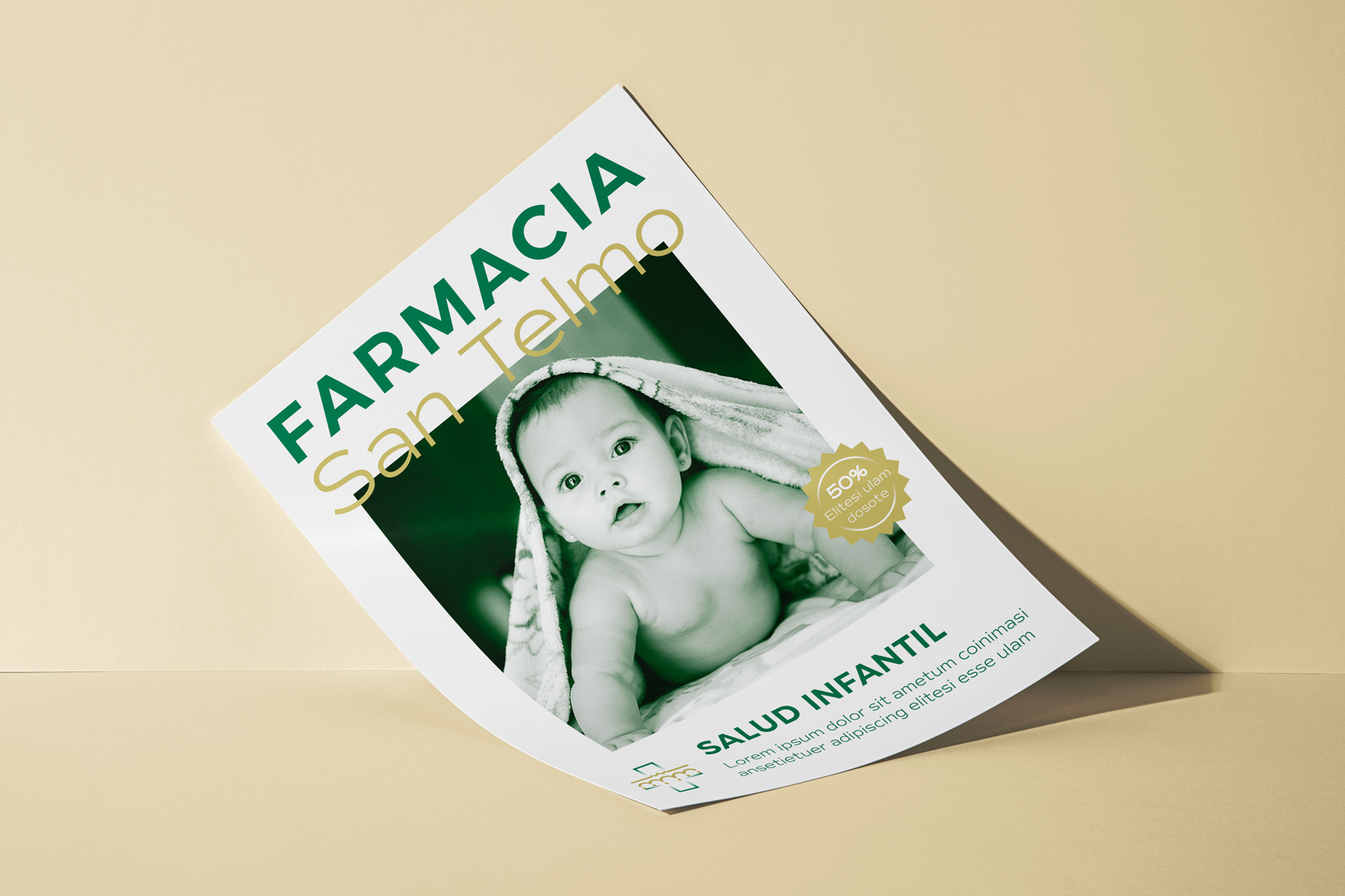
Subsequently, we designed an iconography that could be used on various media, such as posters, products, or promotions. We applied a typographic combination that provided readability, especially considering the pharmacy's most frequent customers.
Finally, for the earthy tone, we decided to use Albero due to its strong connection with Andalucía.
Tags
Awards
Anuaria Selection 2023 - Best logo for a product or service


Ver más proyectos