
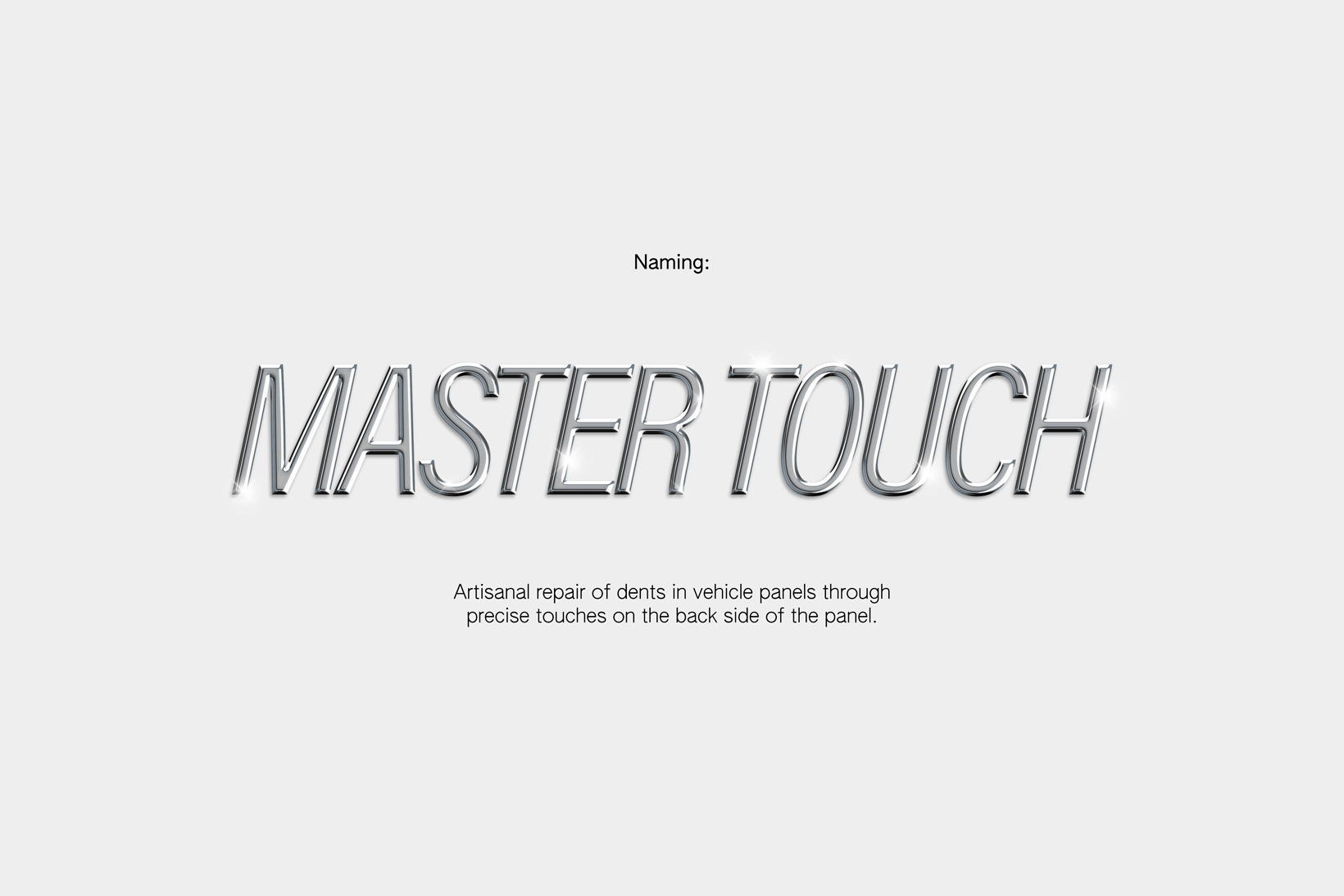
Master Touch
Paintless Dent Repair
Paintless Dent Repair
Briefing
Solution
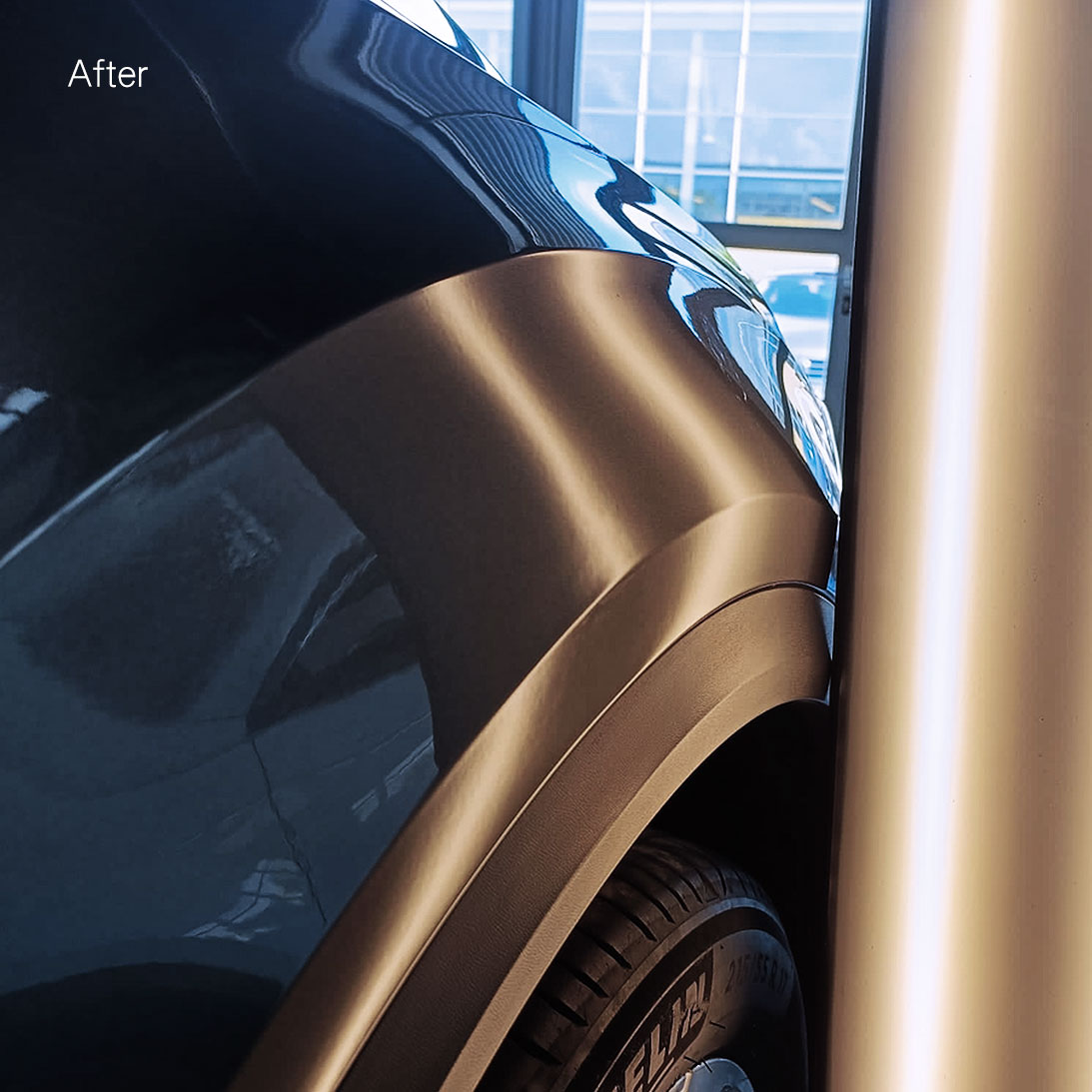
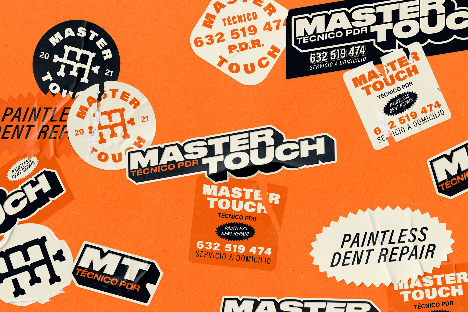
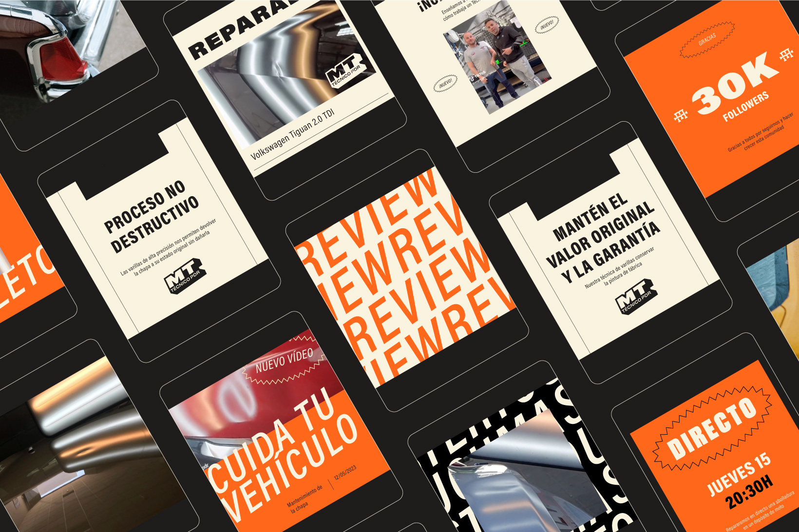
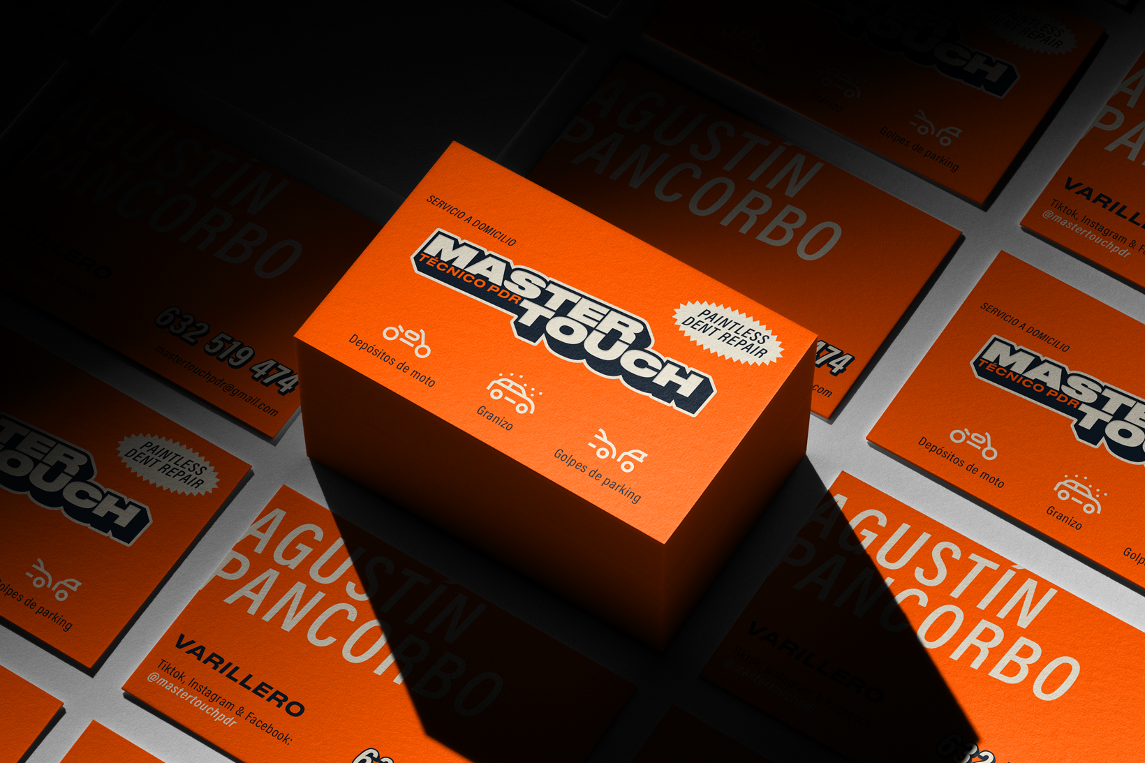
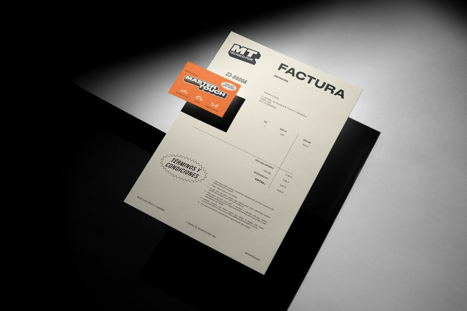
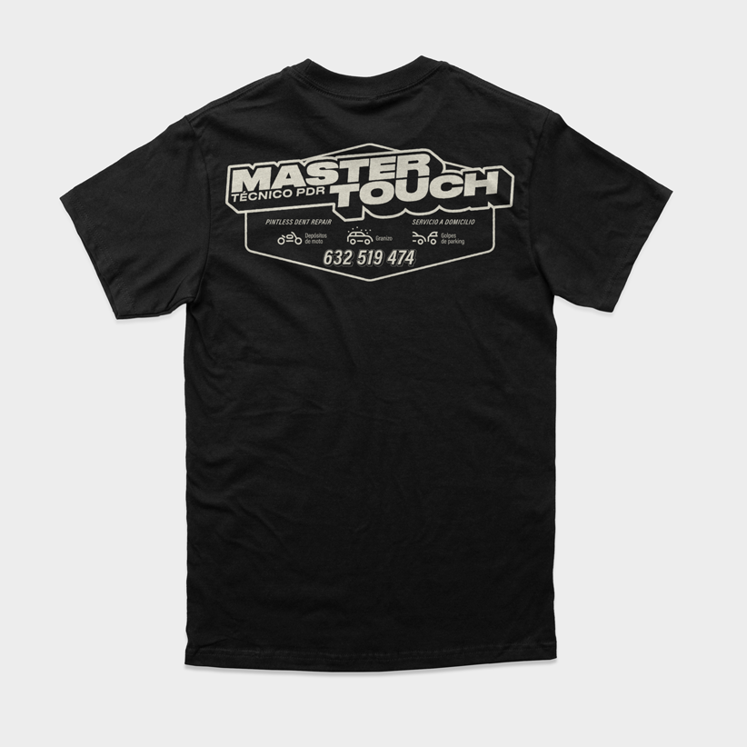
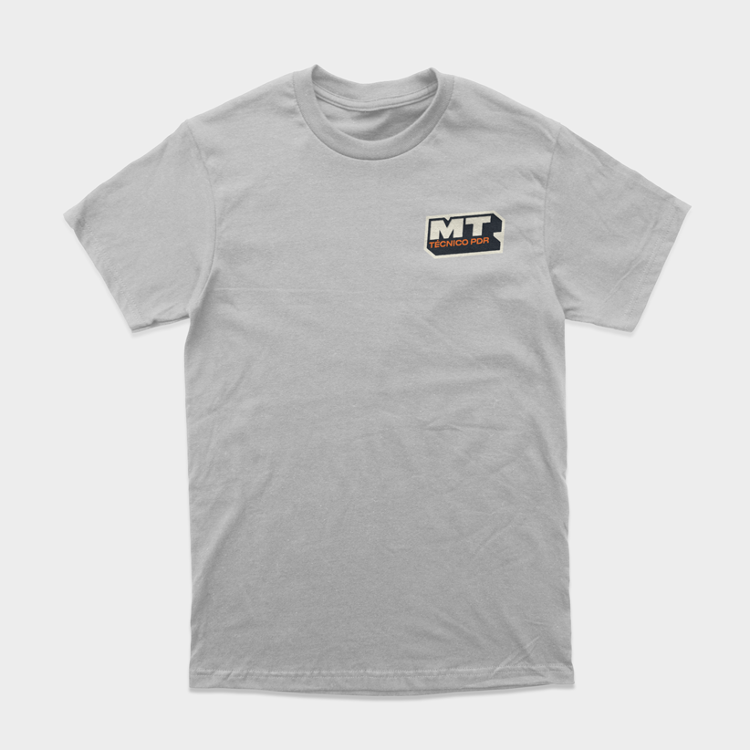
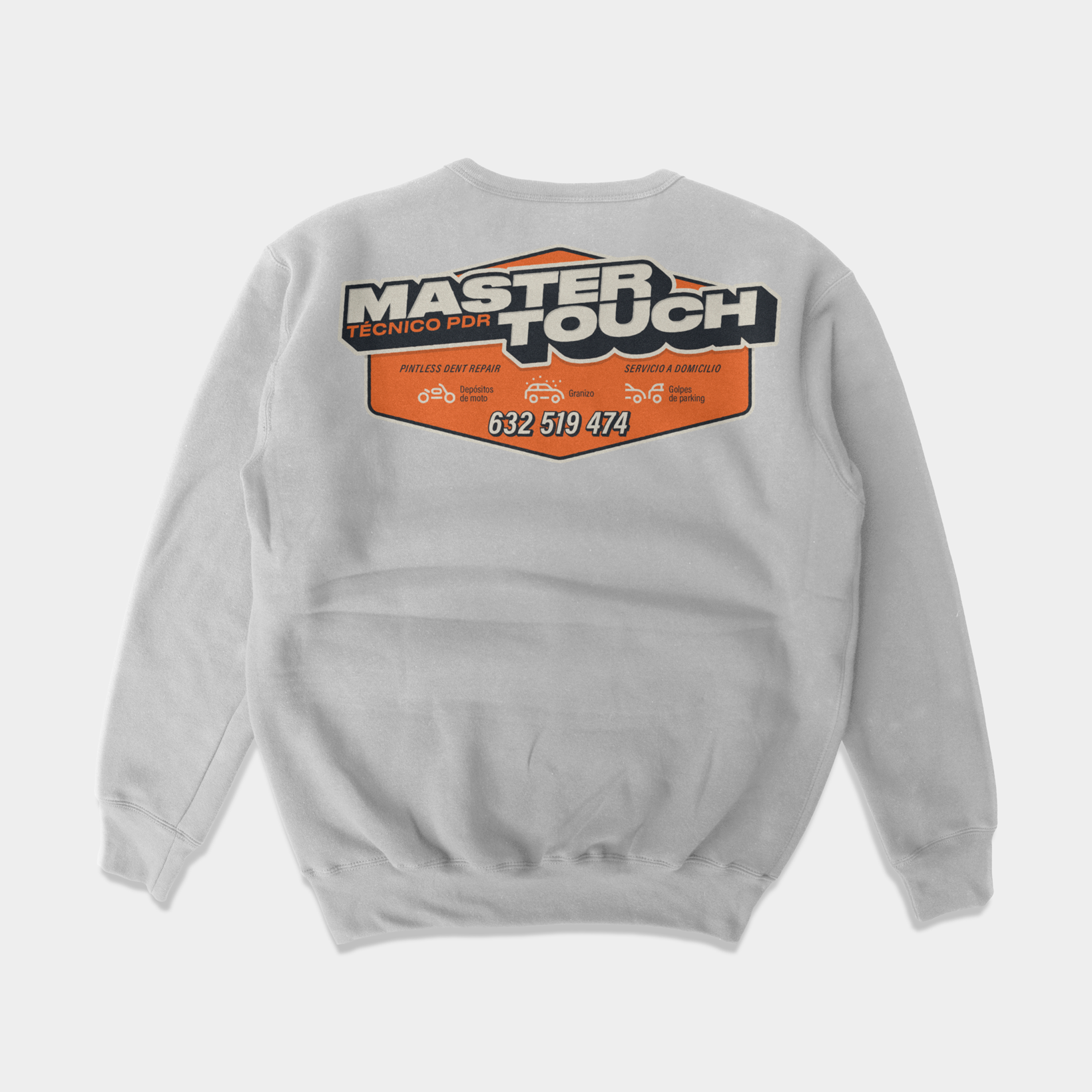
Sometimes we don't have to go far to receive a client's commission. In this case, it was a family member who needed to create a brand identity from scratch for a new Paintless Dent Repair (PDR) company. It's an innovative profession that involves repairing dents in vehicles by applying continuous touches from the inside of the panel, so the vehicle looks like new without losing its original value.
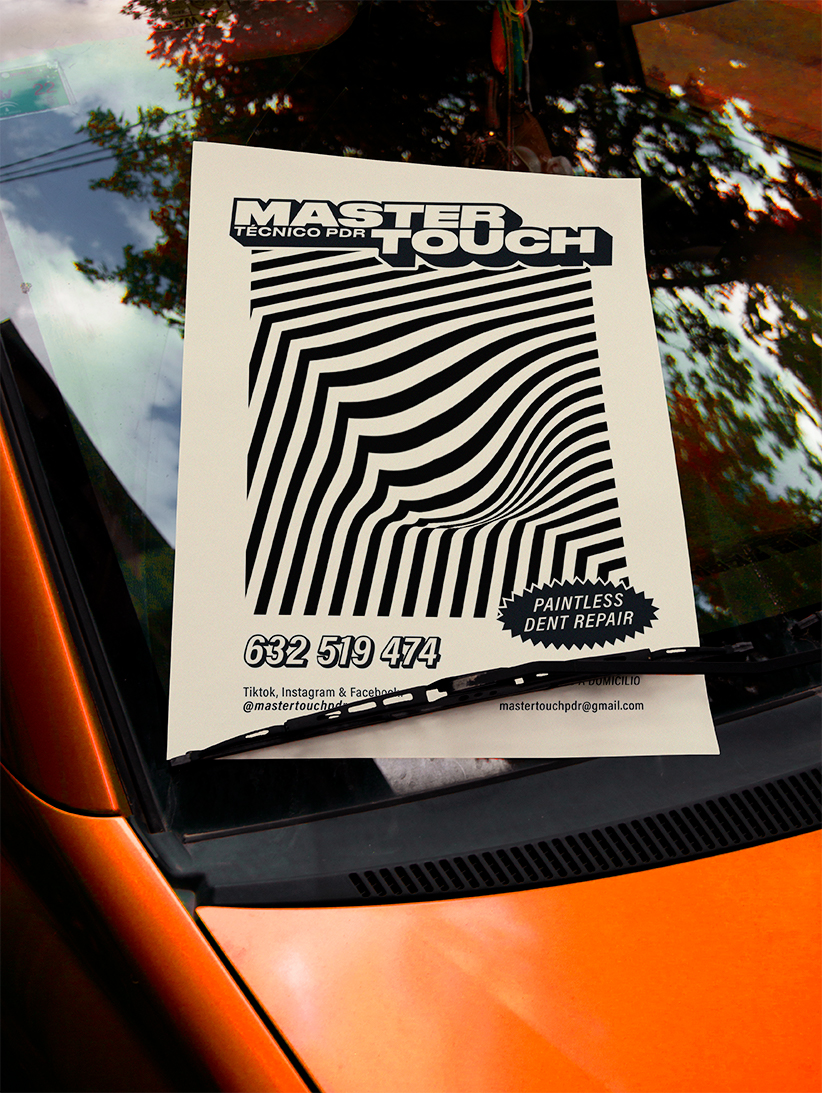
We knew that the key concept was the touch, and that the work of a rod technician was artisanal. A master craftsman (or master of the touch) seeks the exact point to strike and shape the panel. Therefore, "Master Touch" was a logical and highly representative name for a new identity.
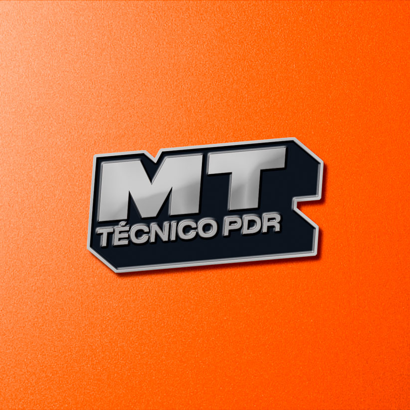
Once the name was established, it was time to give it shape. Drawing inspiration from the client's own personality and the American automotive world, an old-school style was used. From there, creating all the communication elements for social media, stationery, uniforms, and other materials was just a tremendously fun game.
Tags


Ver más proyectos

Beyond with you
Coniex
Coniex
Briefing
Solution
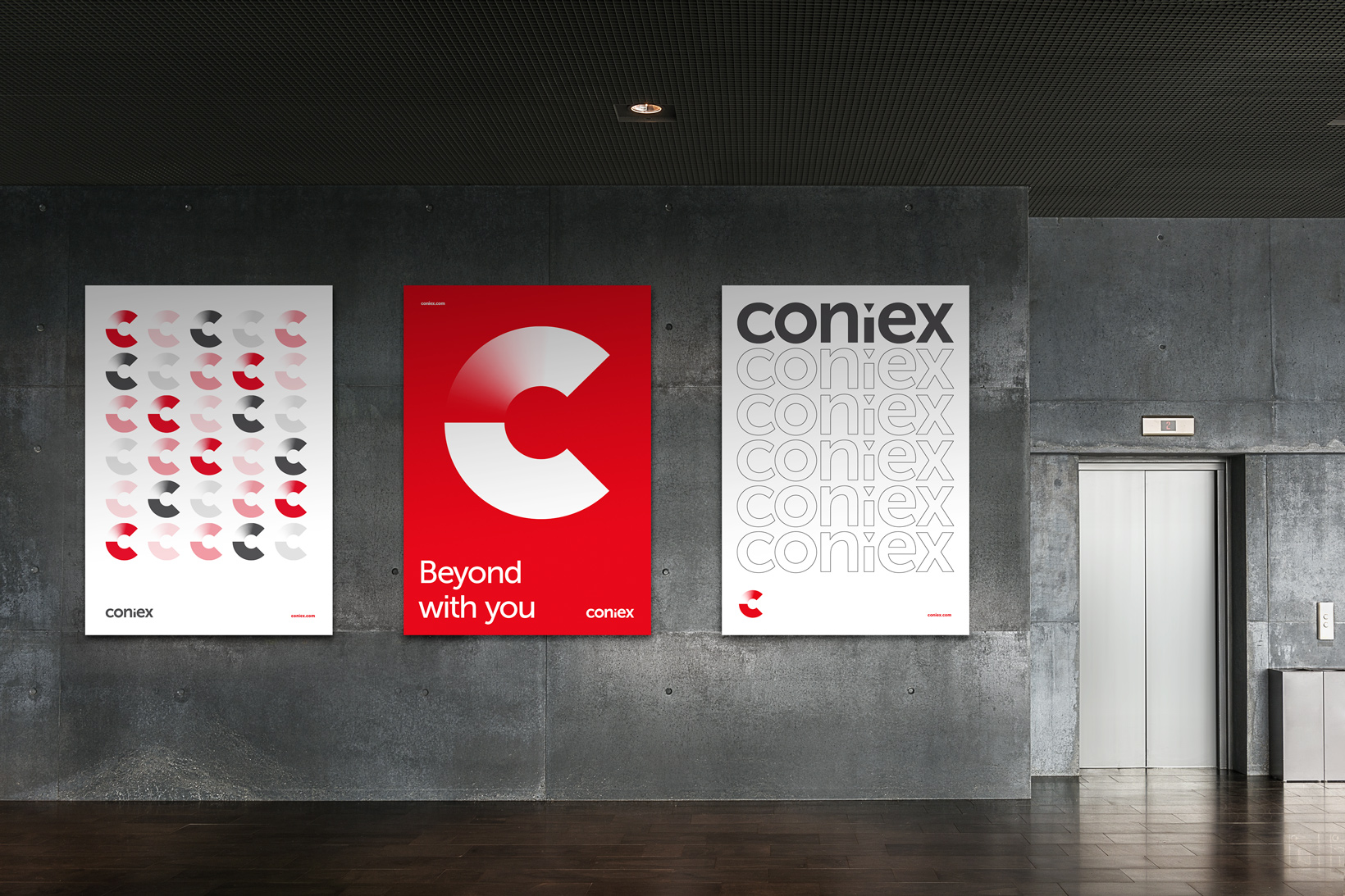
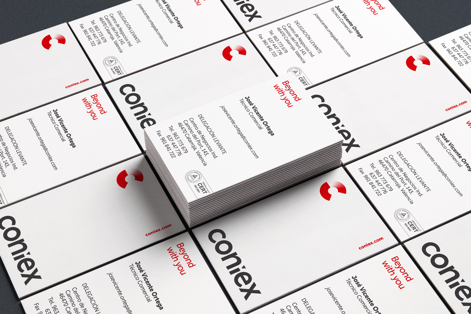
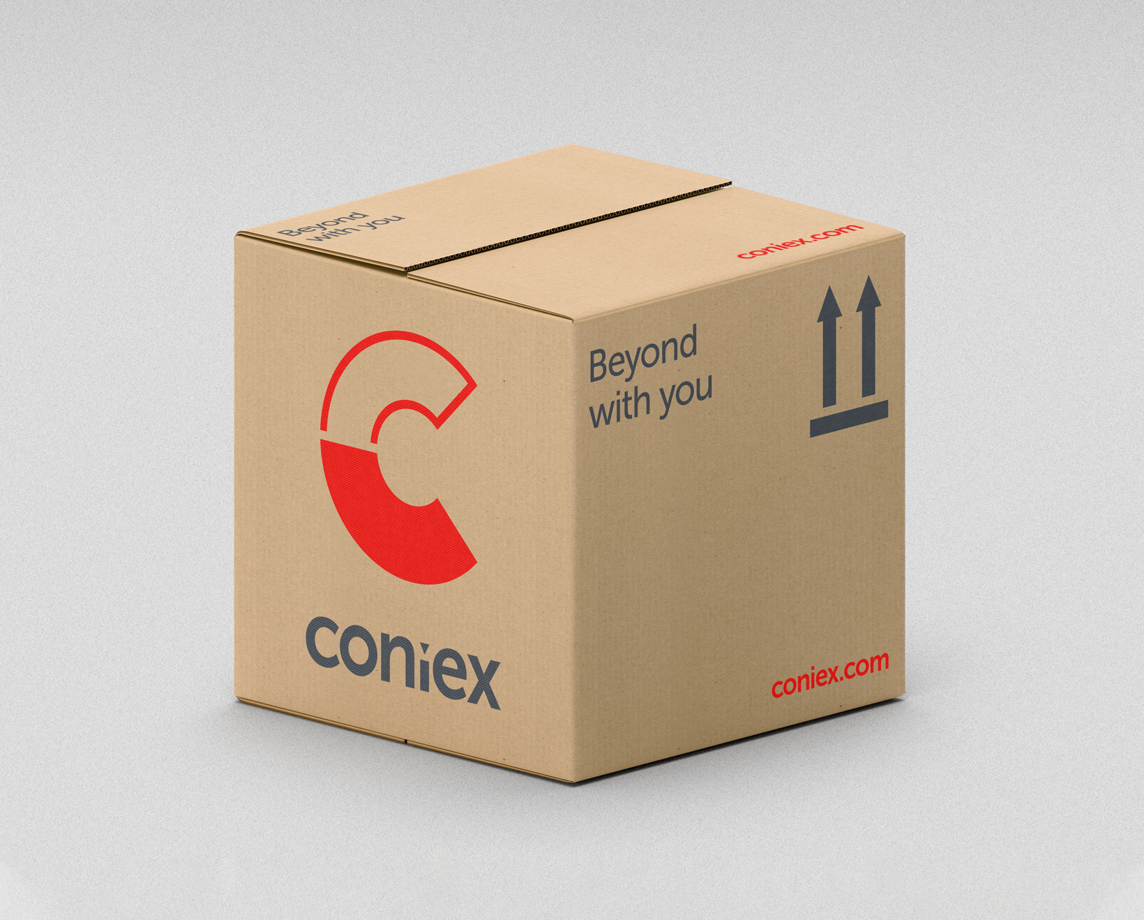
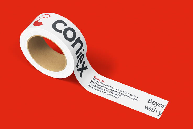
Coniex is a brand with over 30 years of experience in the manufacturing of silicone elastomers and surface treatment. It required a rebranding and identity renovation. They had an outdated image characterized by beveled effects, gradients, and typographic choices typical of the 80s.
The project's goal was to create a visual identity that would maintain the brand's legacy while effectively positioning it in an increasingly competitive market. Additionally, there was a need for a strong connection between Coniex and Siocast, an emerging sister company that had just established its own brand identity.
In tackling the challenge of connecting with Siocast, we chose to unify both brands by using the same typeface (Museo Sans) and adding a triangle at the dot of the "i". Next, we dissected the letter "C" into two equal halves to integrate the concept of surface treatment. The bottom part focused on the world of molds, while the top part reflected the process of blasting a piece with a gradient from white to red. The use of solid red in the bottom part adds a sense of stability and trust in the brand.
The result is a renewed and cohesive visual identity for Coniex that reflects its legacy and showcases its capacity for innovation and adaptability. This strategic and creative approach has established a distinctive brand in the industry that stands out in terms of branding and creative identity.
Tags
© Pixel


Ver más proyectos


San Telmo
Pharmacy
Pharmacy
Briefing
Solution
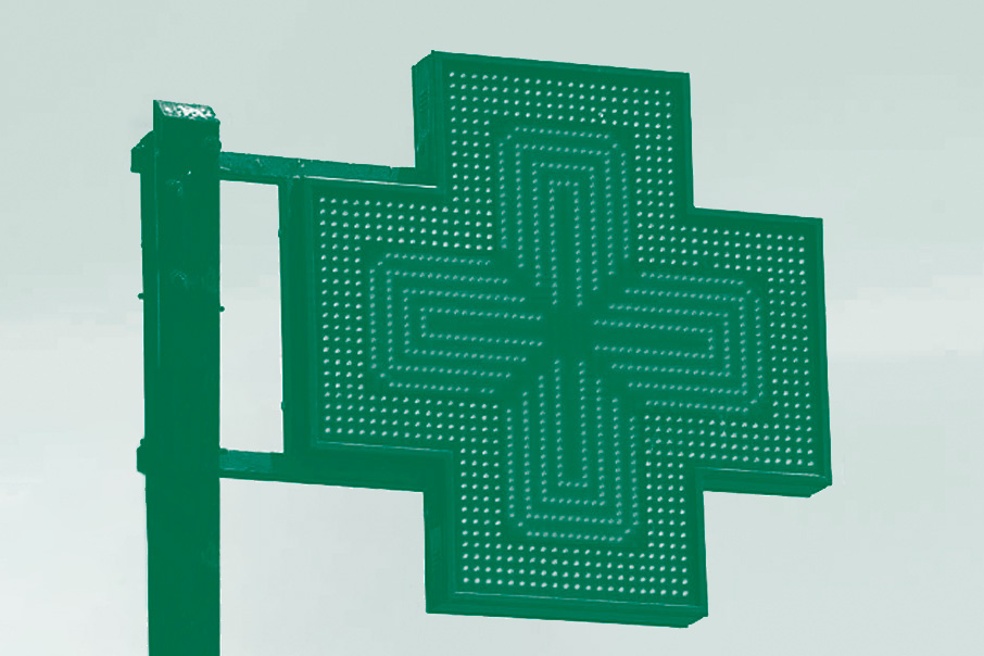
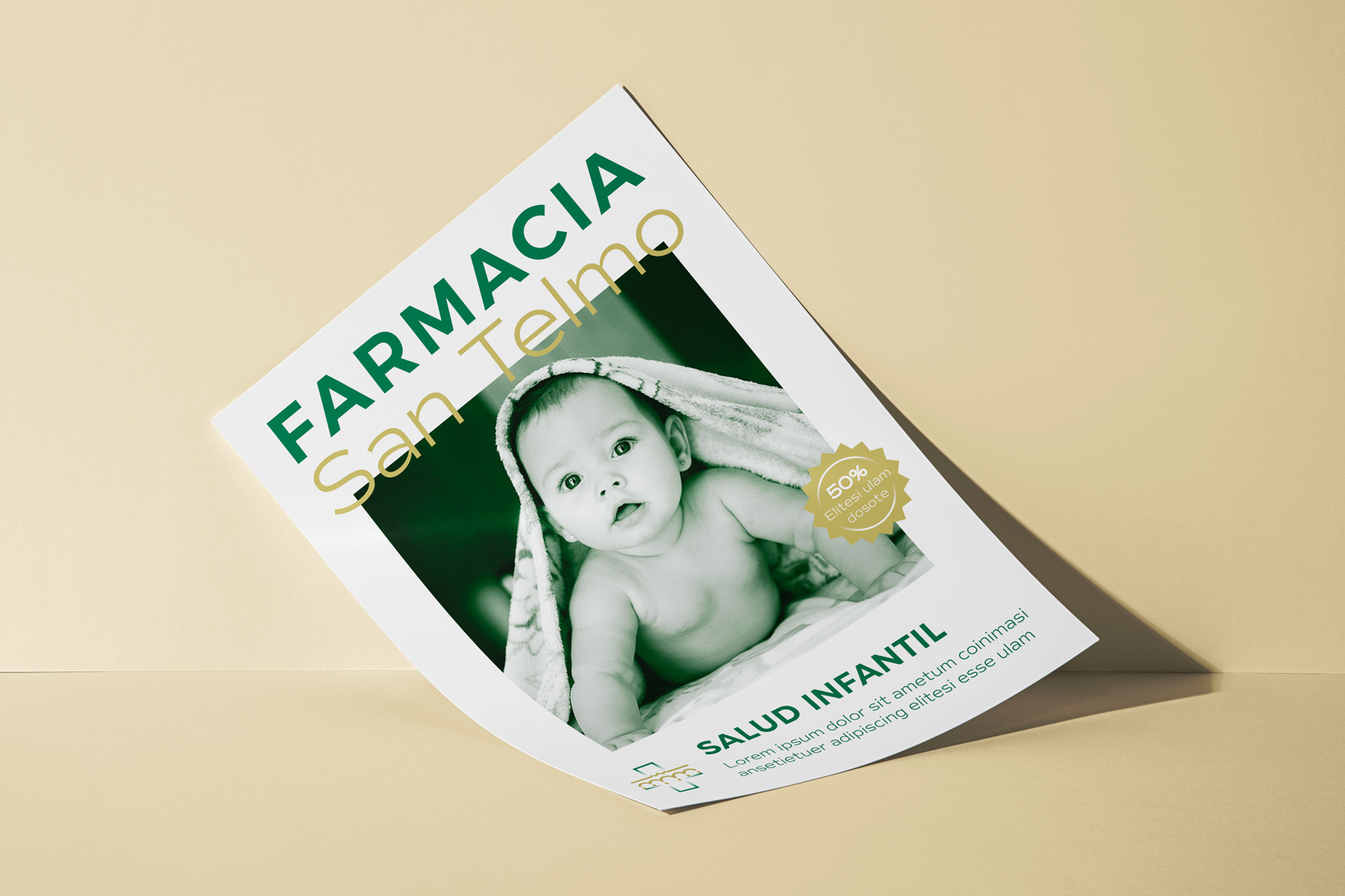
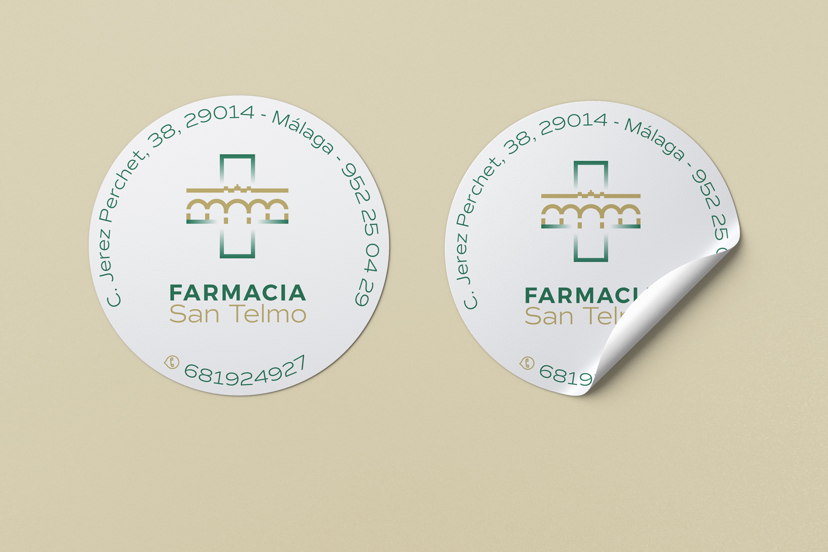
The San Telmo Pharmacy is located in an emblematic area of Málaga and needed a new identity design that would mark the beginning of a new phase. Additionally, they wanted to reflect their closeness to the neighborhood and their name.
The only requirement was to maintain the traditional color of the pharmaceutical industry combined with an earthy color.
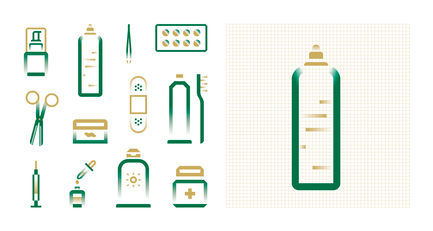
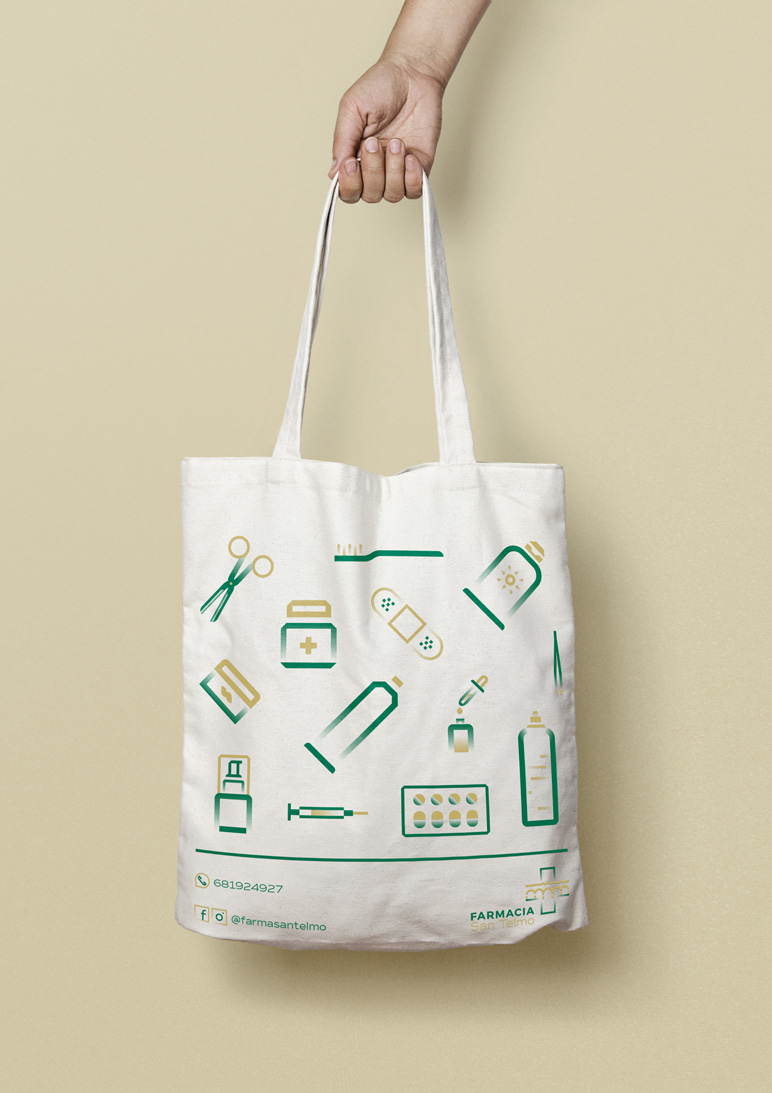
We started by designing a symbol that merged the emblem of the neighborhood (the San Telmo aqueduct) with the pharmacy cross. This way, we illustrated the connection between the pharmacy and the neighborhood.
Subsequently, we designed an iconography that could be used on various media, such as posters, products, or promotions. We applied a typographic combination that provided readability, especially considering the pharmacy's most frequent customers.
Finally, for the earthy tone, we decided to use Albero due to its strong connection with Andalucía.
Tags
Awards
Anuaria Selection 2023 - Best logo for a product or service


Ver más proyectos

Lersa
Energía
Energía
Briefing
Solution
Lersa is the electric company of Ripoll since 1953. Along with the social movement towards energy transition, they needed to redesign their image to appear more sustainable, versatile, and up-to-date without losing their identity.
We redesigned Lersa's branding with a focus on a new type of customer, modern and environmentally conscious. We also adapted the identity to new graphic and digital communication channels. Additionally, we created a unique iconographic language that completes the new identity.
Tags
© Pixel


Ver más proyectos

Genidentity
Molecular Genocosmetic
Molecular Genocosmetic
Briefing
Solution
The need was to showcase a range of products while providing exclusivity and vitality in the beauty salon channel.
To attract attention to the product identity, we placed it in a volatile white environment.
Tags
© Tempo

Ver más proyectos