
Beyond with you
Coniex
Coniex
Briefing
Solution
Coniex is a brand with over 30 years of experience in the manufacturing of silicone elastomers and surface treatment. It required a rebranding and identity renovation. They had an outdated image characterized by beveled effects, gradients, and typographic choices typical of the 80s.
The project's goal was to create a visual identity that would maintain the brand's legacy while effectively positioning it in an increasingly competitive market. Additionally, there was a need for a strong connection between Coniex and Siocast, an emerging sister company that had just established its own brand identity.
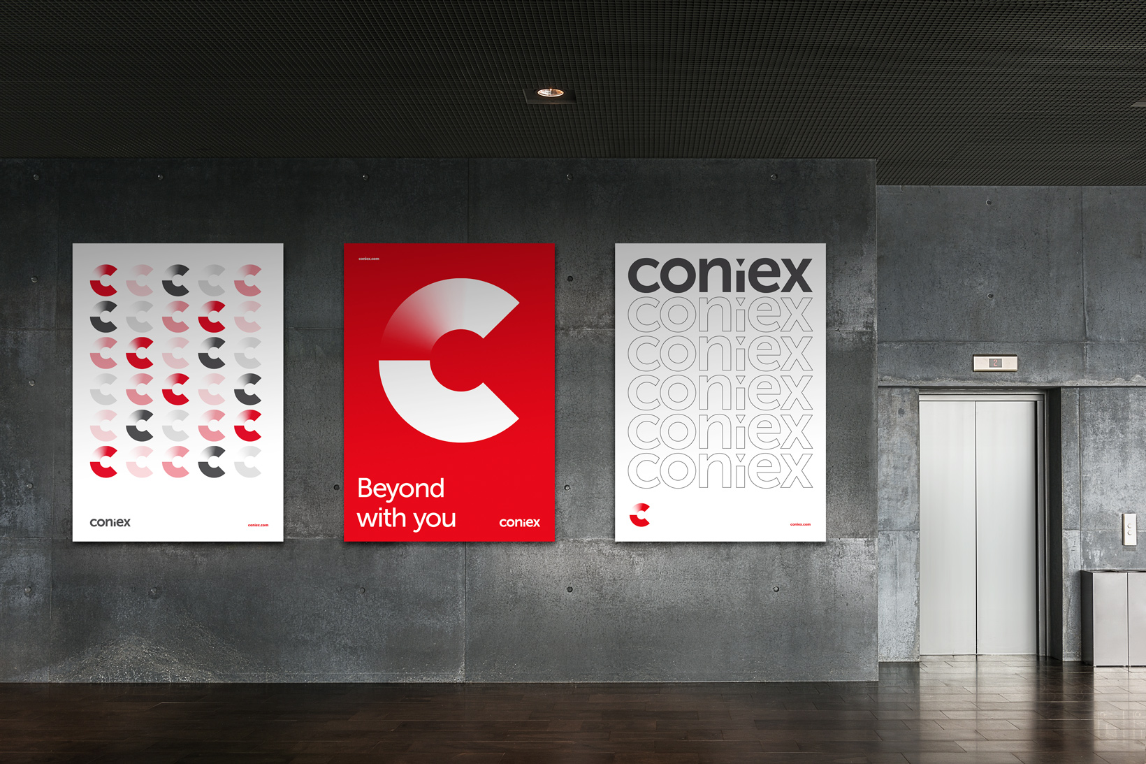
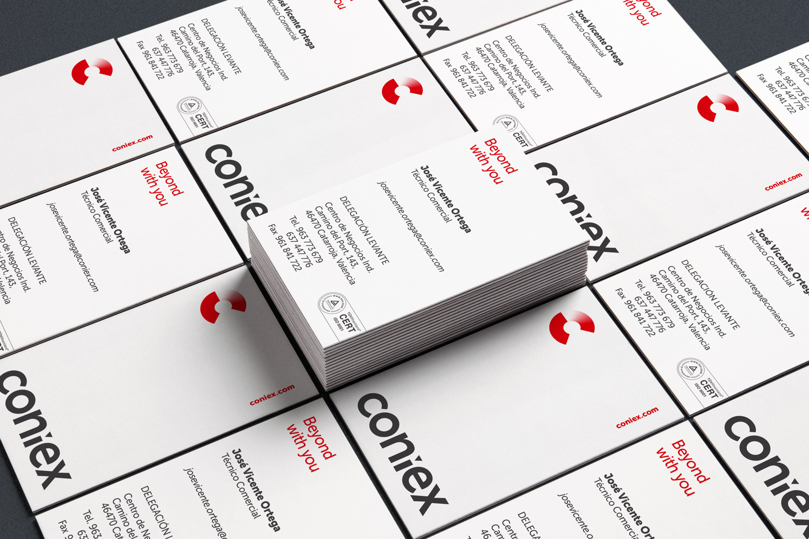
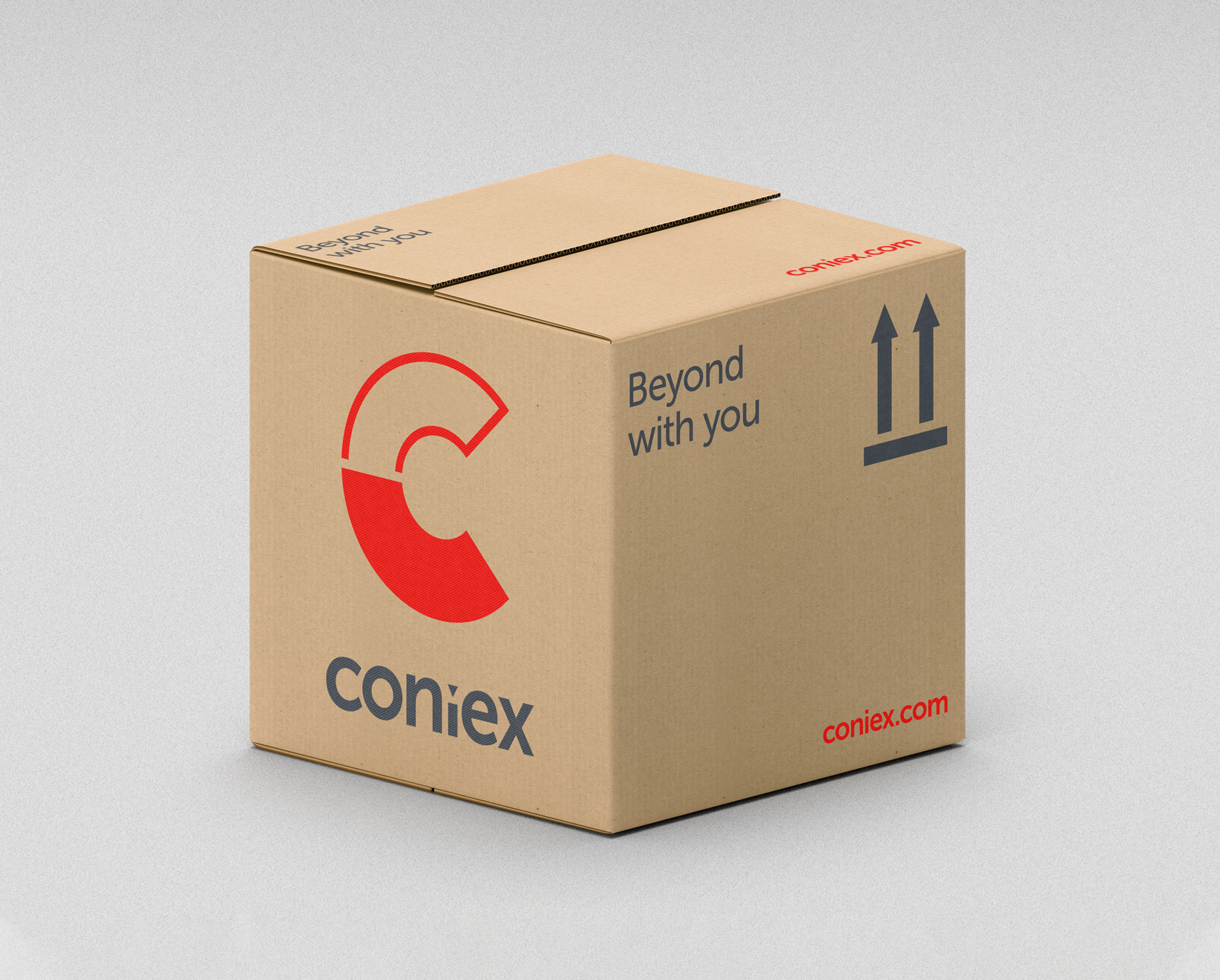
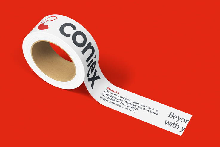
In tackling the challenge of connecting with Siocast, we chose to unify both brands by using the same typeface (Museo Sans) and adding a triangle at the dot of the "i". Next, we dissected the letter "C" into two equal halves to integrate the concept of surface treatment. The bottom part focused on the world of molds, while the top part reflected the process of blasting a piece with a gradient from white to red. The use of solid red in the bottom part adds a sense of stability and trust in the brand.
The result is a renewed and cohesive visual identity for Coniex that reflects its legacy and showcases its capacity for innovation and adaptability. This strategic and creative approach has established a distinctive brand in the industry that stands out in terms of branding and creative identity.
Tags
© Pixel


Ver más proyectos